
Whether we want to believe it or not, smartphones have almost become extensions of ourselves. In February 2024, mobile devices generated 65.89% of global website traffic (SimilarWeb). This means over half of all internet traffic comes from mobile users. This just proves that it’s now more important than ever for designers to prioritize mobile accessibility and usability in their web design strategies. In fact, a survey by Top Design Firms reported that “42% of respondents said they’d leave a website with poor functionality” (HubSpot). Now that we’ve established the critical importance of a mobile-friendly design, let’s look into how designers can effectively meet these user demands.
What is Responsive Design?
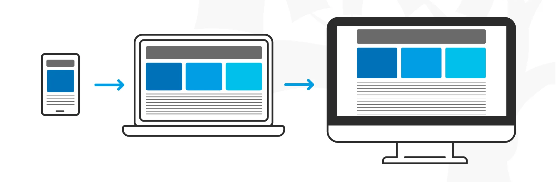
Responsive design is a web design approach where interfaces adapt to a range of device layouts. Essentially, it ensures that websites respond smoothly to the user’s device whether it’s a desktop computer, laptop, tablet, or smartphone. There are a number of valuable advantages to having a responsive website like reaching a larger audience and improving SEO.
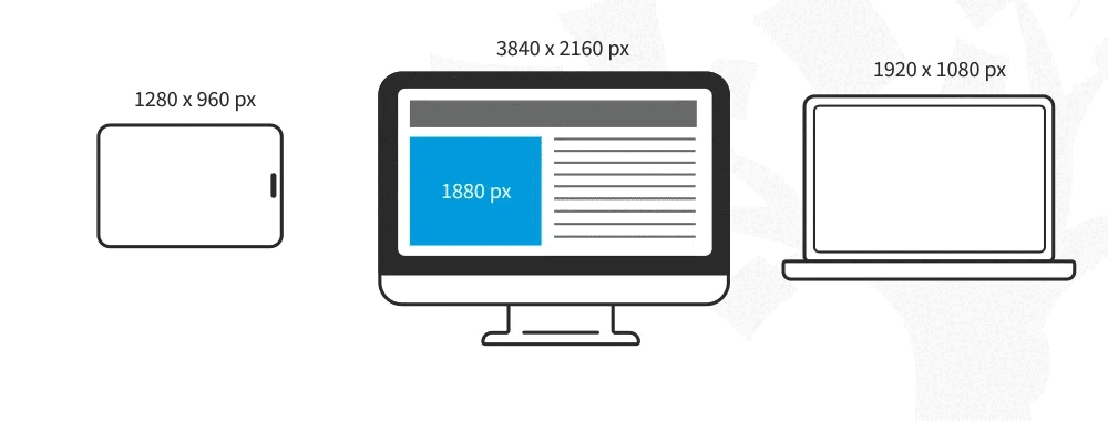
From a technical standpoint, media queries allow developers to make their designs automatically adjust to the browser space by sizing elements using relative units, or percentages. Media queries use filtering to detect the dimensions of the browser window and adjusts the design according to the set breakpoints, values in which the design will change. The most common breakpoints used when designing responsive websites are 1024 and up, 1023 to 768, and 767 to 320 pixels.
When it comes to responsive design, you are designing “for flexibility in every aspect—images, text and layouts” (IxDF). Some best practices include a “mobile-first” mentality, using scalable vector graphics, including three or more breakpoints, applying design patterns, and accessibility with font sizes and styles (IxDF). With all of this in mind, a new design practice known as the mobile-first design approach has emerged.
What is Mobile-First Design?
Mobile-first design starts the process by prioritizing the mobile experience before scaling up to larger screens. Instead of starting with the desktop version of a website and then making it adjust for smaller screens, the most limited screen is at the forefront of the design process. This approach forces designers to focus on simplicity and clarity. In fact, “64% of users prefer a simple website design” (LinkedIn). Designers should adopt this mobile-first practice because it not only caters to the mobile-dominant market, but it also increases user-centricity and enhances performance optimization (Webflow).
Considering the needs and constraints of mobile users, these mobile-first designed websites emphasize core features such as simplified navigation, fast loading times, and responsive design elements. For instance, intuitive navigation like an accordion-style menu allows mobile users to preview menu item sections and minimize the number of clicks required to access information. Moreover, mobile-first designs help contribute to faster loading times by optimizing elements like images and code to help drive and retain website traffic. In fact, “40% of users will leave a site if it takes more than three seconds to load” (Forbes Advisor). Overall, these design principles not only enhance the user experience but also establish a solid foundation for scaling the design up.
To sum it up, “while responsive design is about adaptability, mobile-first design is about intentionality — ensuring that the mobile user’s experience is not just accommodated but prioritized” (Webflow). This distinction points to the idea that simply stacking elements for responsiveness may fall short. It suggests that designing with limitations in mind initially, then adapting while scaling up, is the best practice.
Mobile-First and Responsive Design Principles
Now, let’s consider the principles of mobile-first and responsive design to create comprehensive and user-centric websites. This allows designers to create designs that are not only adaptable but also prioritize the needs of mobile users. Start with a mobile-first, or content-first, approach:
- Content Inventory: Compile all of the elements for your website or application.
- Visual Hierarchy: Prioritize and determine how to display the most important elements from your content inventory.
- Mobile-First: Start with the smallest breakpoint and gradually add more as space allows. Establish a robust, adaptable, and consistent framework.
- Responsive Design Techniques: Employ responsive elements like flexible grid layouts, fluid typography, and media queries to ensure adaptability.
To build upon this approach, there are a number of additional considerations to enhance the user experience. This will help further refine your mobile-friendly and responsive design:
- Think Mobile Design Elements: Simplify navigation and include expandable widgets. Consider an off-canvas menu and accordion or collapsible menu items.
- Design for Touch: Tailor interactions for mobile gestures like pinch, swipe, and tap actions. Enlarge design elements such as buttons for touch inputs.
- Optimize for Speed and Performance: Ensure fast page loading and prompt response times.
- Real-World Use: Conduct usability design tests on various devices (UXPin).
In the long run, adopting a mobile-first approach with responsive design techniques lays the foundation for user-centric and progressive designs across all devices. This strategic approach not only aligns with the preferences of modern users but also produces tangible results. For instance, “57% of internet users say they won’t recommend a business with a poorly designed website on mobile” (LinkedIn) and “74% of online users will return to a website that is mobile-friendly” (Forbes Advisor). All in all, these statistics highlight the significant impact that designs tailored for seamless mobile experiences can have on user satisfaction and website performance.